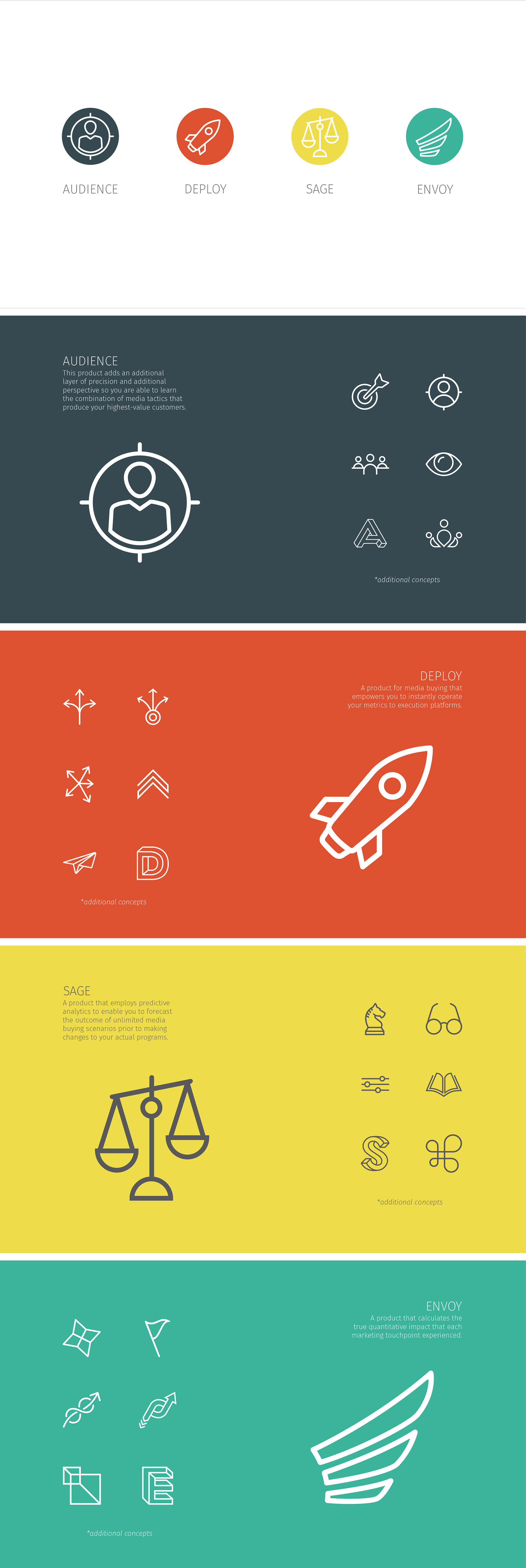
The icons below are product icon concepts I designed for a marketing attribution company who wanted to refresh their brand identity. When starting this project, I began with research. I looked into what exactly these products did and how they made things easier for their clients. I also, defined the words from the general perspective. With the function and the definition in mind, I set out to create a set that was cohesive, yet had a color assigned to them, to easily distinguish the products in a similar way to Adobe Suite and Office 365 products.